
SaaS meets community—Webflow pages that just get it

.png)
Not long ago, community was a nice-to-have. Now it’s what makes your product stick.
We’ve been spotting more and more SaaS brands turning their landing pages into something warmer—spaces that don’t just explain the product but make you feel like part of something. Less “Here’s what we do,” more “Here’s how we roll.”
So we rounded up a few favorites. Pages that manage to feel personal and polished. Scroll on.
1. Folk – A softer kind of CRM
Folk doesn’t try to out-feature HubSpot. It whispers, “hey, your relationships deserve better.” Their brand and site lean hard into this—personal photos, soft gradients, subtle motion. Built on Webflow, the whole experience feels like an AirTable crossed with a friendship app. Real humans. Real use cases. A strong sense that this product wasn’t made in a vacuum.
→ folk.app

2. Outseta – The all-in-one stack that actually feels human
Most “all-in-one” tools feel like they were built by twelve different teams who’ve never met. Outseta’s not that. It’s a single, cohesive platform—auth, billing, CRM, the works—designed for community-driven businesses that want less duct tape and more momentum. Their Webflow-built site is refreshingly honest. Clear messaging, friendly tone, no filler. It feels like a startup that understands other startups—because, well, it is one.

3. Missive – Email that actually works for teams
Email. Chat. Tasks. Calendar. In most tools, those live in separate tabs — fighting for your attention like hungry apps at a buffet. Missive brings it all together, beautifully. Their Webflow site feels like the product itself: fast, focused, and built for actual team workflows. The UI isn’t just showcased—it’s felt. No fluff, no friction. Just collaboration that clicks.

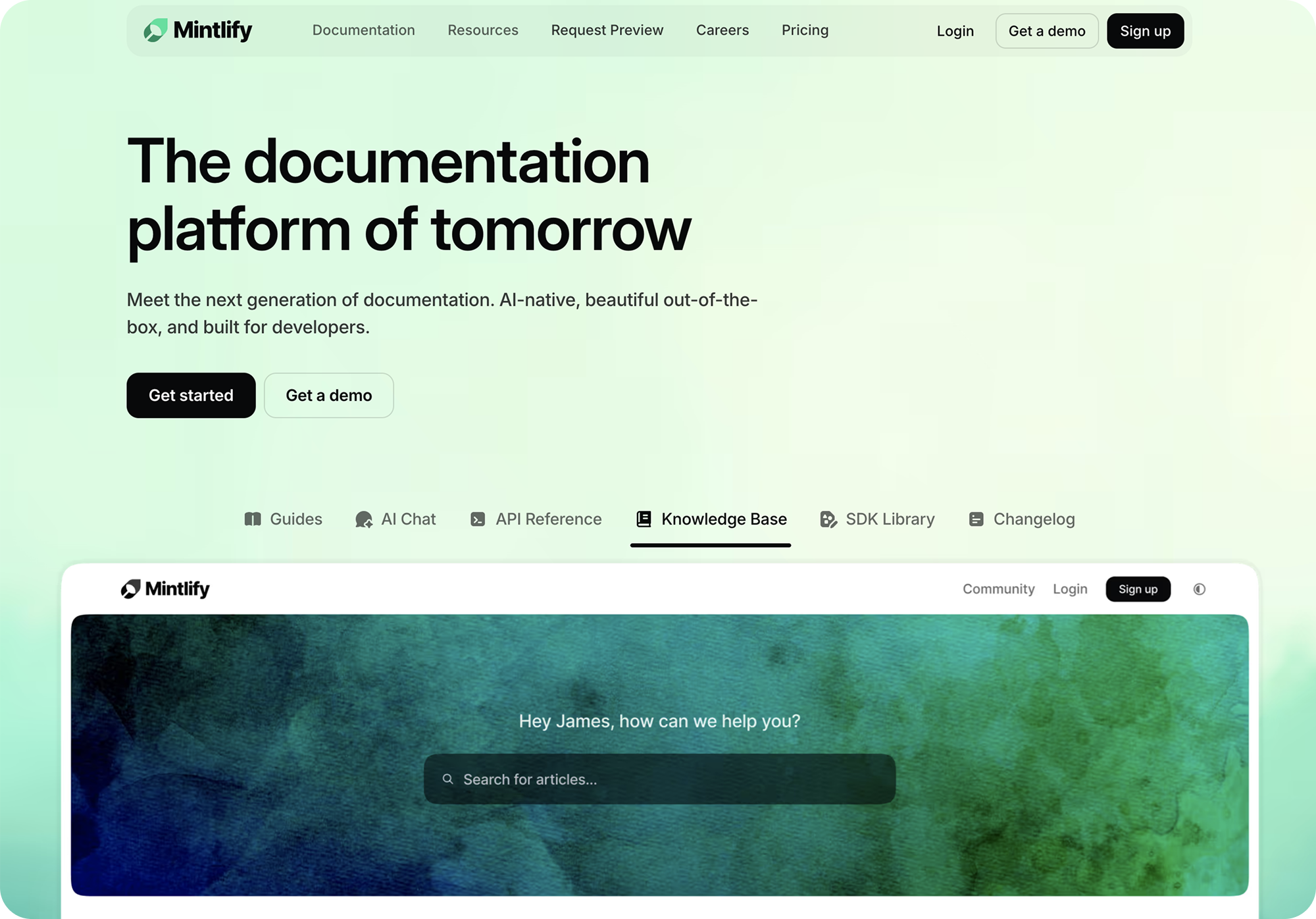
4. Mintlify – Developer docs, done with style
Docs usually sit in the “afterthought” pile. Not here. Mintlify turns documentation into a design moment—clean, interactive, borderline delightful. Their Webflow site proves you can speak to devs and care about the details. With generous whitespace, clear structure, and subtle motion, it invites you to explore instead of CTRL+F your way out. It’s like someone finally gave dev docs the front-end love they’ve always deserved.
5. Suptask – Conversational ticketing reimagined
Slack-native ticketing sounds like something you’d ignore in your inbox. But Suptask flips the script—giving ops teams the tools to turn DMs into structured workflows, without breaking a sweat (or a tab). Their site does exactly what you’d hope: keeps it snappy, clear, and fast. You get what the product is in two scrolls flat. Webflow is used here not for the frills, but for flow.

What ties them together
Click around these pages for a while and you’ll start to feel it. It’s not just the clean layouts or slick scroll effects — it’s the vibe. Like, “Yup, I’m in the right place.”
These sites aren’t just selling features. They’re building something more — a sense of belonging. And that comes through loud and clear in the way they show up. Here’s what they all have in common:
They sound like people, not pitch decks
No buzzwords. No jargon. Just copy that sounds like it came out of a team chat — warm, clear, straight to the point. You get what they do in a sentence, and it feels honest. Human, even.
They prove their worth without overselling
Instead of cramming in features or long-winded explainers, these sites let the work do the talking. Real screenshots. Real voices. Quick, punchy testimonials that quietly say, “Other folks are already into this.” It’s subtle. And it works.
They use Webflow with care, not just convenience
These aren’t slapped-together templates. You can tell someone really thought through the details — the spacing, the flow, the typography. Webflow’s not the hero here, just the tool helping tell the story without getting in the way.
They treat community like the product
It’s not just a Discord link at the bottom of the page. Community shows up in the way these teams build everything — onboarding, design choices, product updates, even support. It’s baked in, not bolted on.
So what do these pages have in common?
They don’t just convert. They connect.
They make space for real humans—not just “users.”
They show personality without losing clarity.
They make you want to join the Slack, not just start a trial.
And that’s kind of the point. These brands aren’t shouting; they’re inviting.
Which, honestly, might be the best kind of growth strategy.
This isn’t a sponsored post. Just pure design nerdery and a soft spot for SaaS teams doing it right. We love seeing what’s possible when community meets clarity — and Webflow gets out of the way.
Co-founder and product designer at Handsdown. Builds in Webflow, fine-tunes the feel, and brings brands to life with clarity and calm.
